How to design a good HMI Display
This article provides engineers with an introduction to designing screen graphics.To learn more, read on…
Introduction
All modern control room systems use visual displays to convey information to plant operators; often it is the primary source of operational data. The clarity of these displays can determine how well the plant is run; lack of information can result in poor operational efficiency, excessive wear and tear and, in extreme cases, failure to see a problem may be dangerous.Display clarity becomes doubly important when multiple VDU’s compete for an operator’s attention especially when different displays have different purposes and are designed by different vendors to differing standards. Often by engineers who have no training in design and little experience of working in control rooms.
Remember also that whilst the designer will sit close up in front of the screen, in use control-room VDUs will be viewed at distance along a desk or even across the room. Whilst detail will be lost, the presence of a plant problem should be evident at a distance – even if the operator has left his spectacles at home!
Our objective here is to provide some guidelines for screen design so that common pitfalls can be avoided and the customer gets user-friendly displays, which are legible, useful and fit for purpose.
Display pages need to be clear, easy to use and legible across a control desk. Here's a quick summary:
- Backgrounds - use muted tones – light grey is good.
- Shadowing is a recommended method for subdividing a display.
- Background graphics should use muted tones, alarm colours should be avoided.
- Use black outlines to highlight objects.
- Text – use a standard font, which will be available on all PC’s.
- Use San serif fonts for on-screen clarity – e.g. Arial.
- Text size needs to be large enough to read at a distance e.g. Arial 16.
- More detailed text should be added as pop-up windows or ‘tool-tips’.
- System Alarm status should be visible on all displays.
- Alarm status should be displayed across the top of the display.
- Alarm colours will follow the convention: Red = alarm, Yellow = warning, green = status OK.
- For Alarms - use additional non-colour dependent indications; position, text, etc.
- Flashing of unaccepted alarms and automatic screen switching on alarm should be avoided.
- Sounds are a good method for highlighting and prioritising alarms.
- Dynamic data should be positioned on scanned areas of the screen; i.e. across the top, centrally and lower right.
- Data should be grouped logically.
- Data values should be clear & units should be obvious (but not repeated with every value).
- Data Resolution should be appropriate to use, avoid too many decimal values; 546.45 C is pointless and unclear.
- If red & green are used for ‘Running’ & ‘Stopped’ indications, add text to make it clear.
- Plant status indication must not rely solely upon colour changes.
- Colour combinations should be chosen with care and use appropriate colours and contrasts.
- Navigation buttons should be obvious and large enough to select quickly.
- ‘Next Screen’ button should be ideally placed at the lower right side of the screen.
- A ‘Home / Overview’ button should appear on each screen (ideally lower left corner).
- Other navigation buttons are best placed at the bottom of screen.
- Control buttons must invoke a ‘confirm action’ dialog box.
- All pages must have a consistent look & feel. Navigation buttons should be in the same place.
- Everything should line up.
Screen Layout
Before designing any screen it is useful to understand how a user will use it. Generally, users will scan a screen in the same way as they would scan a page in a magazine, which in the west means from the top left corner to the right and reading down the screen. Unlike a book, we have no lines to guide us, so we usually only do 2 or 3 incomplete scans of the screen as suggested in example below. In taking this into account, the display designer should ensure that
important items should be on the ‘scan’ line. Alarms should therefore be
across the top of the
page, key data in centre right and maybe buttons and controls on the
lower right. Whilst supporting graphics and the company logo are better
placed on the lower left of the screen.
In taking this into account, the display designer should ensure that
important items should be on the ‘scan’ line. Alarms should therefore be
across the top of the
page, key data in centre right and maybe buttons and controls on the
lower right. Whilst supporting graphics and the company logo are better
placed on the lower left of the screen.Colour Issues
Before deciding what to put on a display it is necessary to have some understanding of how colour can be used. Colour is a powerful tool for enhancing visibility of key data. However excessive use of colour can make a page confusing or overwhelming.On-screen colours are created from 3 primary colours; Red, Green & Blue and the secondary colours; Cyan, Magenta and Yellow are created from pairs of primary colours.
Colour Wheel
A colour wheel is often used to demonstrate the relationship between colours. Example: Complementary contrast is created by positioning a secondary colour
with the primary colour from the opposite side of the wheel. Example:
Complementary contrast is created by positioning a secondary colour
with the primary colour from the opposite side of the wheel. Example: Whilst useful to create impact, using the colours together can make it difficult for the eye to focus.
Contrast of hue created from pairs of adjacent colours can be more subtle, with pairs of secondary colours (cyan, yellow, magenta) producing higher contrasts than pairs of primary colours (red, green, blue).
Example:

Selecting Suitable Display Colours
The eye senses primary colours via the cones, which are sensitive to red, green or blue light, as there are fewer blue cones then our perception of blue is less. This is why thin blue lines are more difficult to see. Blue should be avoided for small display objects however blue does make a good background colour.In selecting colours for a screen it is essential to agree colours for plant status and alarms.
The preferred colour convention, following the standard for safety signs (BS 5378) defines:
- Red = stop, prohibition, danger
- Yellow = caution, risk of danger
- Green = safe condition
- Blue = mandatory action.
Designers also need to be aware that 1 in 12 men have some degree of colour blindness. This normally means that there is some confusion in the perception of reds and greens (also yellows, oranges, & browns) which mean that screen designs should not solely rely on colour to indicate plant condition.
Background Colours
Whilst black and white provide good colour contrast for text they produce too much glare and do not provide a good background for a range of colours. Muted tones are best for backgrounds, greys, browns and blues; these provide a good contrast for the brighter colours used for important dynamic data, such as red, yellow, green, magenta or white.Different background colours can sometimes be used to good effect to immediately identify groups of screens. For example, light grey may be used for the main plant, very light brown for the oil tank farm, light blue for the water plant.
The use of subtle shading to create the illusion on raising or lowering a section of the display can be used with great effect to differentiate areas of the display.
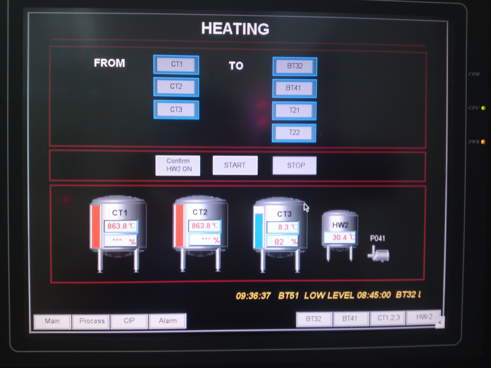
Static Pictures
Screen displays often include a representation of the process plant. When well done, these can often help the operator to immediately visualise the plant and the location of the measurements. However too much detail can clutter the display and make it difficult to see the important dynamic data, so keep it simple.Muted tones are best used for plant representations. Large areas of strong colours will detract from important dynamic data. A good method to make items stand out is to outline the object in black because the eye can easily see a black shape.
Photographs of the plant are sometimes used as backgrounds; often these photographs are poorly lit and invariably contain too much detail and produce very cluttered backgrounds with little opportunity to optimise colour contrasts. Photographs should only be used in exceptional circumstances and should be of good quality.
Sometimes background pictures can be enhanced by the use of graphics from a wide range of graphical object libraries. To add a series of 3D cylindrical tanks in shades of grey, can make a display instantly identifiable, but adding 3D images of pipes, pumps, valves, etc. adds little and will make the display too cluttered.
The temptation to create realism in a background should be avoided, unless you are especially gifted. It is virtually impossible to create good perspective, scale and shading. It will take a long time to produce and the results will be disappointing. Realism is best avoided.
Text & Data Values
Perhaps the most common complaint about displays is that the text is difficult to read, which is shame because text is the most versatile way of conveying information to an operator.Selecting a Font
There are hundreds of fonts available but a few simple ground rules will avoid problems. Select a common font, one that will exist on all computers, such as Arial, Helvetica, System, etc. If you are designing for a Windows operating system and you use an unusual font you may find that when all your careful work is moved onto a different PC that all fonts will be re-mapped. Unexpected gothic script in operator displays is not often welcomed!Fonts are normally classified as ‘Serif’ and ‘San-Serif’. A serif refers to the curly bits at the end of each letter, which lead the eye onto the next letter. Books and newspapers will almost certainly be set in a Serif font in the body text. However, due to the resolution of most VDU screens, it is better to use a San-Serif font such as Arial; because the resolution is not good enough to clearly render the detail of a Serif font.
Having selected a font the next task is to decide on a size. Basically, it should be possible to read key information from several feet away without the need for reading glasses (an affliction suffered by many of us over the age of 45!). Arial at 16 point should be a good starting point. Up to 2 larger sizes should be selected for labels and headings. Once you have selected a basic style – stay with it and avoid the temptation to use different fonts or more than 3 sizes. If you find you need to provide more detail in your text, use a pop-up window or ‘tool-tip’ so that the user can select to see the additional text.
TOO MUCH UPPER-CASE TEXT CAN BE DIFFICULT TO READ AND CAN CAUSE EYE STRAIN, ESPECIALLY IF AN UNDERLINE IS USED. Upper case should be reserved for headings. Text should be in lower case with the first letter of the leading word a capital. It can sometimes be a problem to know where to put capitals – I favour ‘Exhaust Valve Temperatures’ rather than ‘Exhaust valve temperatures’ but which ever you choose, you should be consistent.
Text Data Values
Text, and especially data values, should be grouped in areas of the screen. Randomly distributing data values around a picture makes it difficult to scan for data values. If you want the user to compare data values, then put them next to each other in a table. If you have several tables with the same data types, e.g. temperature, pressure, speed; ensure that the data is presented in the same order in each table.Care should be taken with units. It is important to know that pressure is displayed in millibars but writing ‘mBar’ next to every measurement is unnecessary and clutters the display.
Avoid unnecessary decimal places. The displayed Data Resolution should be appropriate to use; 546.45 C is pointless and difficult to read, (the accuracy of measurement is probably limited to +/- 2C).
Subtle changes in background relief can often be used to enhance the presentation of text and data. If you choose to include this in your design, it is important to ensure that you are consistent.
Alarms and Plant Status Animation
The key aspect of an HMI display is the dynamic plant data. There are 2 basic types of dynamic data: Alarms and normal Plant Status data.Alarms
Alarm status for the overall plant, preferably organised into groups, should be visible on every screen and there should be a simple navigation route to access the screen containing additional details about the alarm. The alarm colours should follow the safety convention:- Red = stop, prohibition, danger
- Yellow = caution, risk of danger
- Green = safe condition
- Blue = mandatory action.
Pictorial changes could include shape changing, a change in the position of an indicator, having additional text or objects appear on an alarm. Flashing of unaccepted alarms is very irritating and stressful and should be avoided. Similarly, automatic changing of displays should be avoided – to have a page disappear when you are working on it is irritating and in extreme cases a cascade of alarms can produce so many screen refreshes, an operator can be locked out of the system.
Audible alerts can be very useful, especially if the system is able to create multiple tones and pitches. These tones can be used to transmit the importance of an alarm, research has shown that a high pitched, fast pulsing sound automatically conveys urgency, whereas a lower pitch, slow pulsing sound is less urgent.
Whatever convention is used, alarms should be placed where they can be easily seen, our preference is along the top of the screen.
Plant Status Animation
Whilst conventions are generally well defined for alarms, some designers have problems when using colours for plant status. Some are tempted to use green for go to indicate running plant and red for stopped, whereas the alarm logic would suggest using red for dangerous, running plant and green for safe, stopped plant. The convention in the power industry is RED for RUNNING, but to be sure (and to account for colour blindness) plant status should always be indicated by another means preferably text – ‘Running’. If there is risk of confusing a red status indicator for an alarm then other colour combinations should be used.Navigation and Control
Navigation
To use a VDU system, the operator must be able to change between pages quickly and easily. With the wide acceptance of Microsoft Windows, the operator control device of choice are ‘mice’ or similar pointing devices, which have largely superseded keyboards as a primary navigation tool. Perhaps the most intuitive pointing device is the touch screen.Whatever the choice of pointing device, the screen ‘hot spot’ must be obvious and large enough to be hit easily. There are 2 main preferred methods of denoting a ‘hot spot’; the most obvious is to add a button to the display. These should be clearly labelled to indicate the effect of the button. The other approach is to embed the hot-spot in the picture. This can be used to great effect in an overview display showing a schematic layout of the site; ‘clicking’ over any area will switch the screen to a more detailed display.
Navigation between displays should be simple, obvious and quick, and will normally be organised in a logical tree structure. The next step in a navigation sequence should always be the most obvious; the lower right hand part of the page is a good place to put a ‘next step’ button. It should also be possible to back-track and return to the previous display. All screens should also have a button or hot-spot to reset the screen to the top-level display, often called the ‘Overview’. This is the equivalent of a ‘Home’ page on a well-designed web-site. This ‘Overview’ button need not be too obvious and should be located in the same position on every page; the bottom left is often preferred.
If possible, navigation buttons should be grouped together to make it easy for the operator to use them without having to move a mouse or trackball too far. If the user is expected to routinely switch between two or more screens, it is a nice idea to locate the button for the next screen in the sequence at same point on each screen, so that the user can click quickly between displays without moving the pointer.
Control
Where buttons and hot-spots are used for control, then a pop-up window should be used to confirm the action selected: e.g. ‘Start Feed Pump – OK or Cancel’. This avoids accidentally activating plant and allows the new user to explore the system without fear of causing damage or injury.Summary of Recommendations
There are no absolutes when designing HMI displays, and everyone will have their own preferences.We hope that in preparing this paper, many of the common failures can be avoided.
Whatever style you adopt when designing an HMI display, it most important that the style should be followed throughout the suite of displays. Each display should have the same look and feel; navigation buttons should be in the same place and everything should line up.
Display pages need to be clear, easy to use and legible across a control desk: